Design of the Interface
The goal was to take full advantage of handheld devices to create an intuitive and simple navigation scheme.
For the Hutmacher project, we wanted to be true to delivering the experience of what it might have been like to stand in the middle of open prairie and imagine what a homesteading family might have felt like when they first arrived.
The idea was to not depend on numbered signage or QR codes, which detract from the authenticity of the site.
How Information is Organized

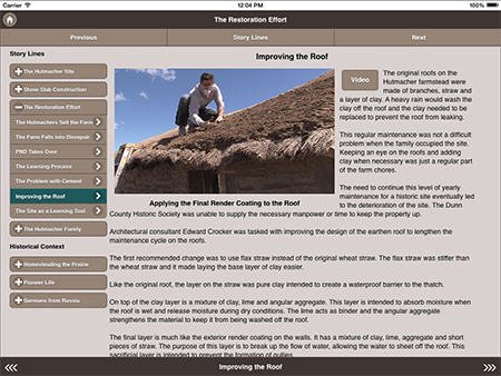
The first step is to organized the information into logical categories, if necessary, we sub-divided each category into sub chapters that are ordered in a logical sequence. By using this approach, we can utilize the swipe function to move between chapters like a person would if they were reading a book. In fact, a user could just use swipe function to navigate the entire display.
|
The display doesn't let you get "lost"

We made sure that if a user clicked on an object to get additional information or to view a video they would always be returned to the place where they started. |
